Pages

Sunday 20 September 2015

Fire Salamander and Alpine Ibex: Dealing with Different Challenges.

Working on commission means being ready for any types of challenge. A couple months ago, Sandro Bacco, the art director of Technologist, a European magazine of science, asked me to create one whole visual of 3-page article showing 6 species that are affected by climate change. It included two subjects that are a contrast to paint, wet-looking and glossy Fire Salamander and furry Alpine Ibex.

Painting Wet-Looking Salamander with Masking Fluid

To be honest, the idea of painting something so slick and glossy for the first time was frightening me. The "bumpy" skin of the salamander required many tiny "white" spaces (highlights) and, at the same time, a smooth gradation between shadow and mid-tones, which is harder to paint than a surface that is glossy but smooth and even. Moreover, I thought white gouache was not the correct answer. A few tiny dots of white gouache could be unnoticeable but for this focal-point highlight, the opacity and thickness of gouache would look totally out of place with the transparent watercolour. It can make the painting look shabby.

Since I mostly paint using wet into wet technique, my initial thought was using masking fluid to protect the intricate highlights of the salamander's skin while spreading paints effortlessly.

Masking fluid on the yellow markings and white highlight
If you need to know what is masking fluid, you can read my older post here and how to use masking fluid without ruining your painting or brushes here.

Painting salamander deepened my understanding of using masking fluid. Different from using masking fluid for separate parts (e.g. my previous work: masking stamens from petals of cherry blossom), creating highlight is trickier. The reasons were (1) the highlight had to look like it actually came from the same colours with the base; (2) sometimes it has a slightly different colour as a reflection from surrounding; (3) it has varied edges, such as hard/crisp, soft, and sometimes lost edges.

And here were some insights I took note of to remind myself:
1. For parts in different colours, I prefer to paint them first before applying the masking fluid, e.g., the yellow markings of the salamander. It reduces the risk of hurting my paper's surface because even a little damage on the surface will be amplified when using wet into wet (my main technique).

2. Consider the sequence of how you remove the masking fluids before you apply them, because the cohesiveness of dried masking fluid will pull everything off at the same time. Case in point: the masking fluid of the highlight and the yellow marking were prevented from coming into contact with each other. In so doing, I could keep the masking of yellow marking stay on until the painting was done whereas the highlight was removed quite earlier.

3. Highlight is actually not a pure white and some edges are soft and lost. Thus, I removed the masking fluid of the highlight after the first 3-4 layerings of paints. If I removed it in the late/final stage, I would get hard-edged, too contrasting, and unnatural highlight. After having it removed, I carefully added the next paint part by part to keep the highlight and create the soft and lost edges.
[My tips]: eradicator brush can soften the edges. I used my 1/8" sized flat brush the same way I did here and here.

And below is the final illustration after I painted cast shadow under the amphibian.


Painting Furry Ibex with New 'Spiky' Comber Brush

Different from my first experience of painting furs in my earlier illustration of brown bear for a wine label, this new commission required a more photo-realistic result, with more varied colours and contours of the fur. And I was happy that I bought a new 'Spiky Comber' from Rosemary&Co. I think it is an advanced version of the flat comber brushes I used before. Compared to my flat comber brush, the curved edge of the new 'spiky' comber brush creates not only many tiny strokes at once but also varied lines. With 1/4 sized brush, I could vary the amount of lines in 1/4 inch or 6.35 mm width of space, from many tiny lines (>15) to 1-2 lines if I lifted the brush.

Here are some stages I took to paint the ibex:
1. I painted the general shape of the ibex with wet into wet washes using round brush. It didn't have to be perfect and precise, but clear enough to indicate the contour of the furs. *My apologies, I didn't take picture earlier. The lower and left side of the ibex no.1 are what I meant with the initial wet washes.

2-3. After the painting was dry, I built up the fur with dry brush using new 'spiky' comber brush and sometimes round brush. *Further info about the technique can be read in my previous post.

[My tips] [1] I sometimes added wet into wet washes upon the layers of the dry-brush to darken some areas more quickly or to slightly soften the dry-brush edges. It would not lift up the previous layers of paint if you did it on a completely dried layers of dry brush and only brushed the wet washes lightly.

[2] If your paper is as forgiving as mine (Fabriano Artistico HP 300 gsm), you can even enhance the highlight by softly erasing the paints using eradicator' brush. I wet the area to be removed with clean water by stroking a damp brush gently, then pat the pigment away with tissue (I wrote the technique here).

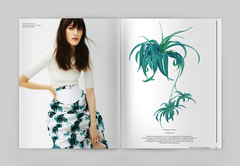
I think this post is already too long. I hope you find it useful. And here is how the illustrations look on the magazine's layout. Enjoy!


Thursday 27 August 2015

Aerides thibautiana: Bird-like Orchids and Colours Permanency

Blossoms that look like a band of birds praying

When I first time saw Aerides thibautiana while glancing through orchids in my favourite nursery, I almost missed this remarkable subject of painting. The orchid had tiny blossoms and modest, all purple colour, unnoticeable pattern and common petals shape. However, after I could not find what I looked for, I scrutinized again the Indonesian orchids that were blooming. As I paid close attention to the Aerides thibautiana, I was surprised to see what I saw, an orchid that resembled band of birds!

I had seen some pictures of unique orchids that looked like other species, but only on the internet. That day, I finally found one myself and it was native to Indonesia. What a prize!


Do you see what I saw? Doesn't Aerides thibautiana look like a band of bird praying? 
Since the plant was quite expensive, I was so grateful that Mrs. Tarigan (the owner of the nursery) gave me an inflorescence to bring home. She even offered me to take more than one (I refused) and other orchid blossoms as well.

At home I quickly photographed the flowers since I didn't want to miss their prime time. Later, I was happy to be able to paint the illustration based on my photograph and the specimen, which surprisingly remained intact for almost a week.


Colour Permanency

I knew I would want to use Opera Rose to imitate the vivid colours of the blossoms. However, since I learnt that Opera Rose is one of those fugitive colours, I replaced it with WN Quinacridone Magenta, which used the same pigment PR122 but without the fluorescent dye.

Fugitive colours are colours which are based on impermanent pigments or dyes that lighten, darken, or otherwise change in appearance over time. The opposite of fugitive is lightfast, which meant (a dye or pigment) not prone to discoloration when exposed to light and the atmosphere.

The recognised testing system of lightfastness is ASTM (American Society for Testing and Materials). They rate and classify paints to: I (excellent), II (very good), III (moderate) and IV (poor). If a paint has not been rated, it is described as N/A= No assignation (Not Rated). Reputable paint manufacturers usually provide information about the lightfastness and other qualities of the paints, such as Winsor & Newton. You can check their websites or check the label of your paints. Further, you consult an easy to read yet informative blog post, "What are fugitive colours?" by Katherine Tyrrell or read (and bookmark!) a very useful source, Handprint.

I learnt that some florilegiums and botanical societies and some reputable exhibitions require artists to use only paints with good permanency rating (I and II only). Thus, rather than finding my work got rejected from an exhibition, I resisted my personal satisfaction in seeing vivid opera rose colour for this botanical work. However, I still keep some fugitive but favourite of people paints on my paint box, e.g. Alizarin Crimson, Aureolin, Rose Madder Genuine and of course, Opera Rose and sometimes I use them for short-term or reproduction-orientation commissions.

The replacement paint, Quinacridone Magenta has exactly the same pigment PR122, which "is a lightfast, semitransparent, staining, dark valued, intense violet red pigment", said Bruce MacEvoy from Handprint, "PR122 has the strongest violet hue of any violet red pigment available in watercolors". However, after using it a lot in this painting (along with Winsor Violet (Dioxazine) PV23 and Permanent Rose PV19), I found that it underwent a drying shift. The dried paint was not as bright/saturated as when it was still wet. Sadly it slightly lightened. Adding more layers of the same paint somewhat helped but only to a certain level, not as intense as I wished.

Anyway, I am happy to gain this insight. I love to know how different
each paint behaves (oftentimes not a big deal) and how practice gives me idea on how to deal with it.

Here are my work in progress and scanned illustration of Aerides thibautiana.

Friday 26 June 2015

On Instagram

Dear my lovely readers,

I have not posted for some times, I am sorry for that. Having Nawang, my little girl, and folowing my calling to be a professional illustrator require almost all the time I have.

No new blog post doesn't mean I do not paint. In fact, I have been very productive these months ^-^. I have been working on 3 personal paintings and more than a half-dozen commissions.

Some clients wanted to keep their project confidential but some gave me permission to publish what I did for them. I am certainly excited to share them to you. However, since I do not have much time lately, I tend to post them using my mobile phone on an image-centric online service.

If you are curious as to what I am working on, please visit my Instagram account @inikeke. You can either visit this url, follow my Instagram account @inikeke, or click the new badget "view on instagram" at the top right side of this blog page.

I hope to see you there. Thank you :)

Wednesday 1 April 2015

Dendrobium spectabile: Limited Palette and Magic Eraser Sponge

LIMITED PALETTE

Learning from my failures when painting Phalaenopsis cornu-cervi and how important to effectively pick and mix paints, I decided to do my Dendrobium spectabile with as few pigments as possible. I used only 3+1 paints, W&N Perylene Maroon (PM), Indanthrene Blue (IB), and Daniel Smith Hansa Yellow Light (HYL) and, for some area, Permanent Rose.

I am pleased that these four are all single-pigment paints and two of them (PM and IB) have a great range of colour-mix, from which I could get all colours I need to paint the orchid. They covered the "white" lip/labellum, greenish yellow sepals and petals, to the very dark burgundy pattern on the lip.

Beside having significant amount of clarity of colours when finished, I found painting with fewest possible pigments eased my mind. I worked with wet in wet washes a lot, which allowed me to let the paint flow and mingle with each other. These limited palette really helped me avoid muddy colours, which could easily result from inadvertent clashes of pigments. In addition, the limited pallete brought about harmony to the whole painting.

MAGIC ERASER SPONGE

Magic eraser sponge can completely remove unwanted marks from the paper but I avoided using it due to its abrasive nature. However, I made a mistake, which couldn't be erased using eradicator brush. Hence, I used my eraser sponge this time, but with care. 

My tips of using magic eraser sponge:
1. Make sure the colouring is final. Once rubbed with the sponge, the paper surface impacted is somewhat damage and difficult to paint.
2. Use masking tape to protect the other area for precise result. Make sure all paint and paper is completely dried.
3. I cut the sponge into a small square because I prefer to use pointy corners to rub tiny areas.
4. Dampen the sponge and rub it gently until the unwanted mark completely removed. Wash and rinse the sponge regularly.
5. Remove the masking tape when the paper completely is dried
6. If you need to tidy the edge, apply only dry brush, as dry as possible.

DENDROBIUM SPECTABILE

The orchids are native to Papua island (Indonesia and PNG). The blossoms have an alien look, but I fell in love with it since our first encounter at a local orchids nursery in Yogyakarta back in 2013. Their extremely twisted sepals, petals and curling lip made them look as if they danced and their intricate patterns were the very first reason I had a crush on them.

By mid of this month, I visited the same nursery and I was happy to find it bloomed, reminded me of my long desire to paint it. So here is my latest painting, Dendrobium spectabile, The Dancer!

Friday 27 February 2015

[Commission] Süddeutsche Zeitung Magazin

I could be out of my mind when deciding to work on a commission from Süddeutsche Zeitung Magazin. I had only about a month to work on 5 botanical illustrations and, at the same time, I and my family were moving from the UK to Indonesia for good. We had no house when we arrived in Yogyakarta and the contrasting weather was also a real problem for Nawang, my toddler. Mostly, where and when to paint were the big problem.

The twists and turns of my effort to paint in these chaotic period will take hours to tell! Let's skip it. I thank my family (especially husband) for making it possible and still love me after these months.

And now the magazine is out! Of course, it looks great! Just to see some of my illustrations on the cover feels like all those hardworking days/nights is paid in full.

And taking a look at the fashion pages is such a pleasure. It is said, after a hurricane comes a rainbow. And indeed, the "rainbow" looks wonderful! Thank you, Ralf Zimmermann and Sarah Beckhoff, for having me in this great project!


Please check my behance to see the complete original illustrations. Thank you! :)

Credits
Photographer: David BornScheuer
Styling: Almut Vogel
Illustrator: Eunike Nugroho

Photo Assistant: Alex Orjecovschi, David Fitt | Digital Operator: Benjamin Roulet | Hair: Helene Bidard / Artlist |  Makeup: Kathy Le Sant / airport agency | Styling Assitentin: Anna Koppmann | Model: Helena Severin / Viva Models | Retouching: Christine Schubeck / Bird Imaging | Location: Studio Daguerre | Thanks to Studio LB Paris.